PharmacyX – Finding the flow for online pharmacies
- Services:
- Brand Rollout
- Branding
- Campaign
- Illustration
- Positioning
- Tone of Voice
- UI Design
- Website

Rundown: PharmacyX’s mission is to develop great technology solutions that empower patients and maximise the efficiency of community pharmacy operations. PharmacyX frees up pharmacists and their teams to focus on excellent patient care with smoother processes, paperless workflows and patient self service.


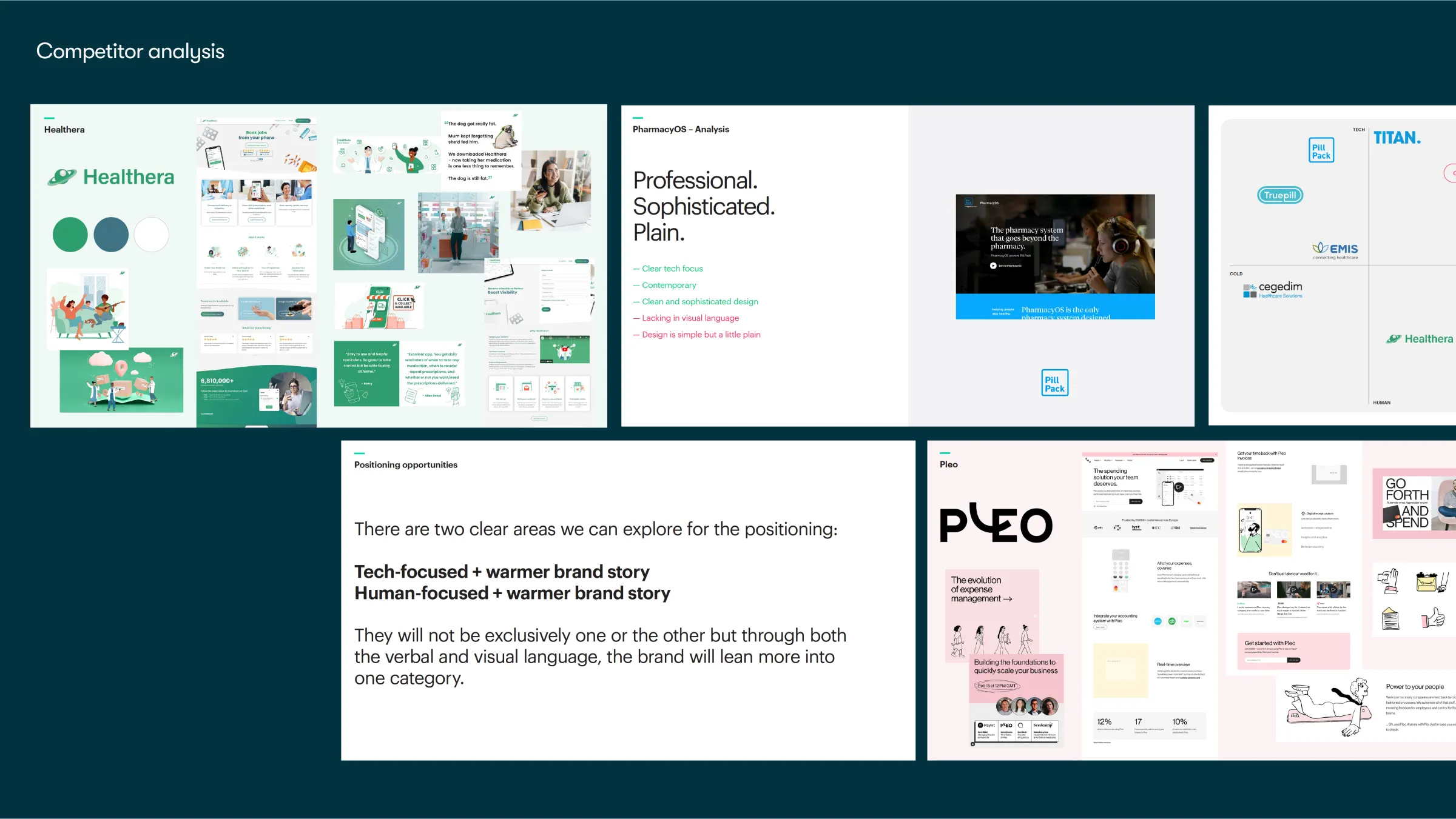
PharmacyX is the UK’s only pharmacy software provider that also operates pharmacies, giving them a rare, first-hand understanding of the challenges facing community chemists today. They needed a brand that could champion the role of local pharmacies while also appealing to larger Enterprise clients looking for scalable, future-ready solutions.
We partnered with their team to create a brand and website that would balance empathy with innovation—establishing PharmacyX as a trusted, credible, and modern force within the healthcare technology space.


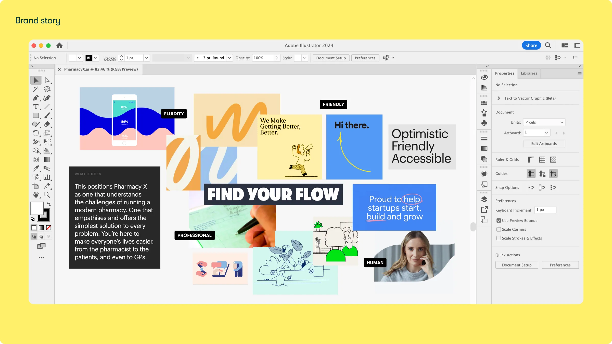
Bringing clarity, warmth, and energy to the future of PharmacyX— with a brand that feels as human as the communities it serves, and as robust as the technology that powers it.
We wanted to create a visual system that was flexible enough to appeal to the different scales of their target customers, that would capture their relationship to community pharmacies and the people they serve, but also the robustness and innovation of their technology platform and app.
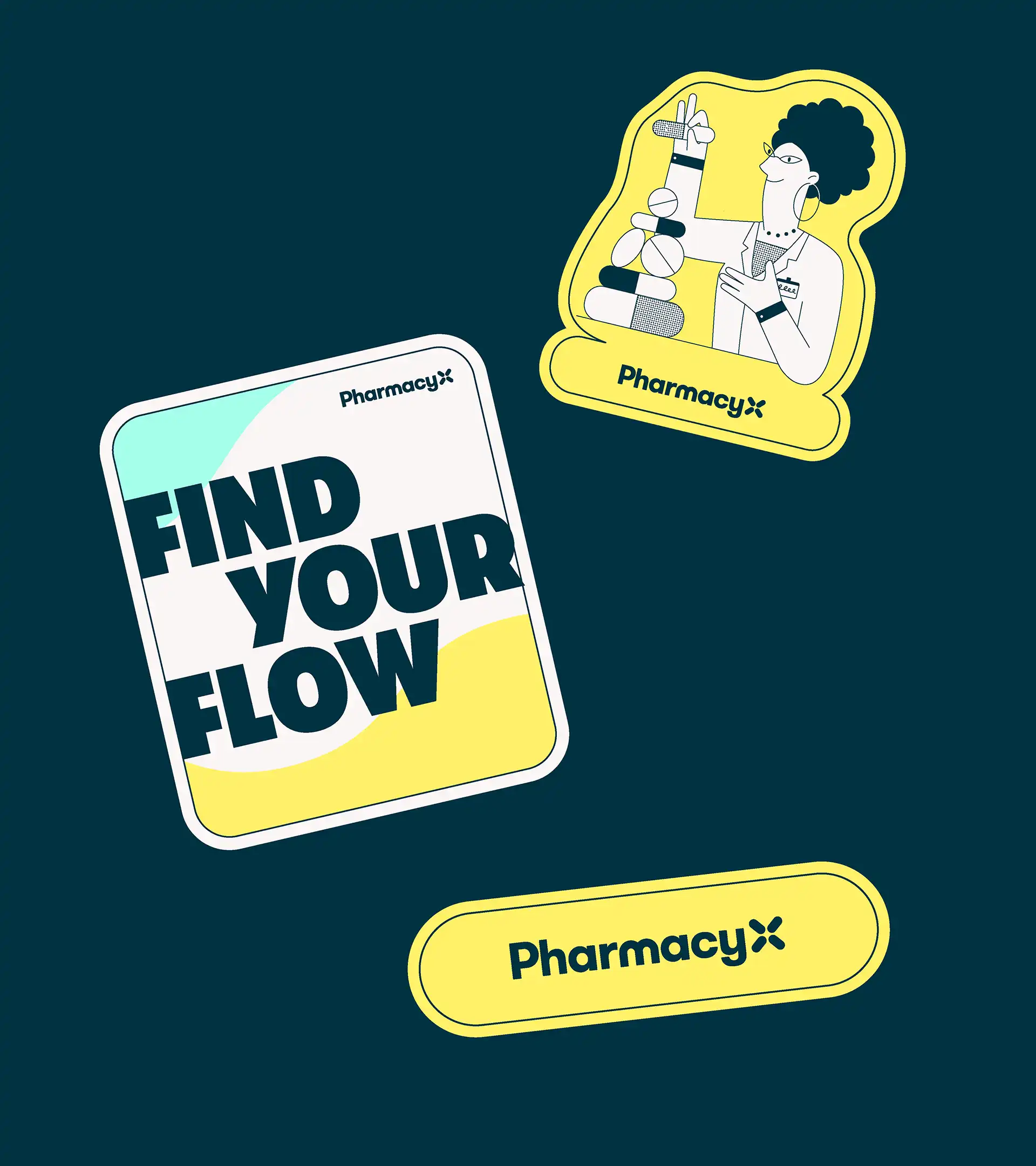
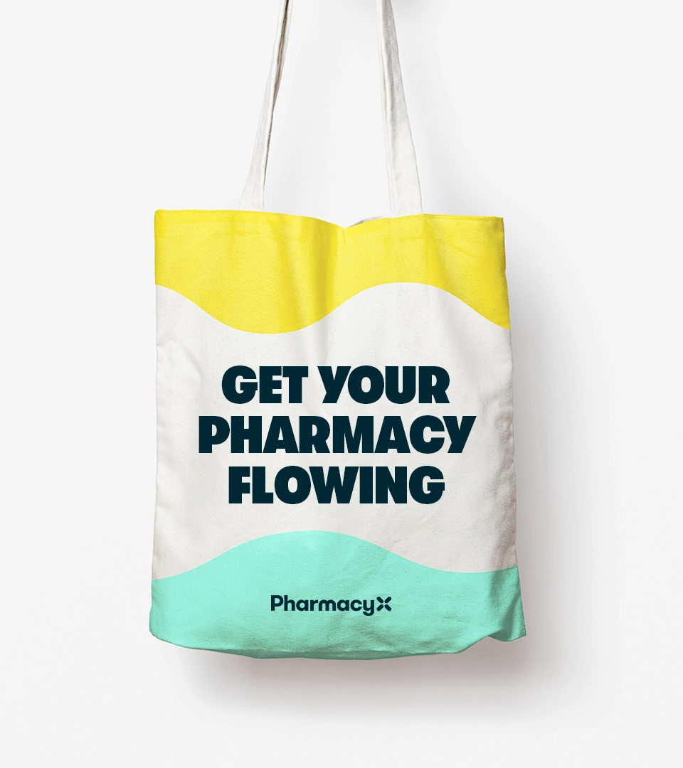
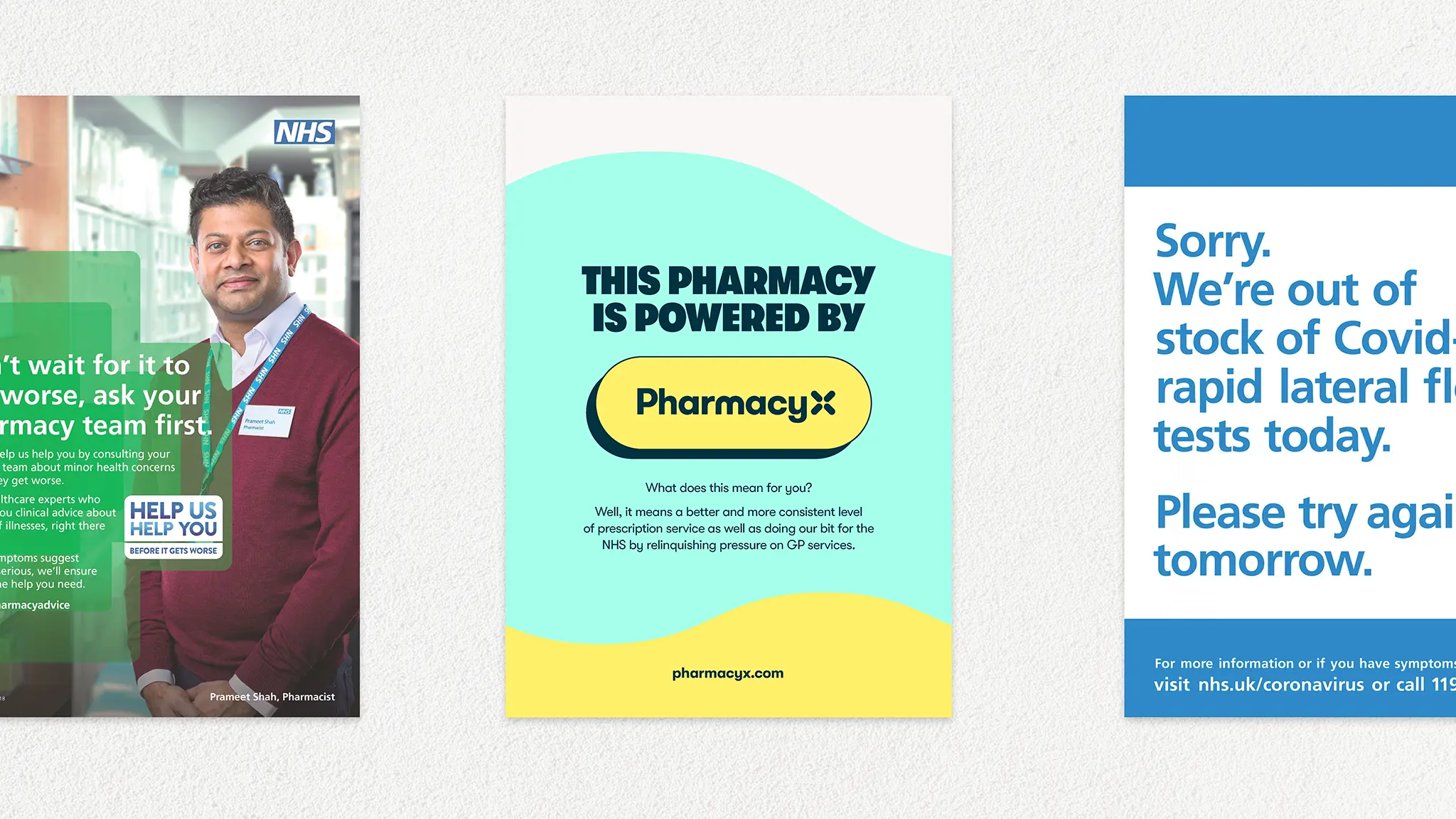
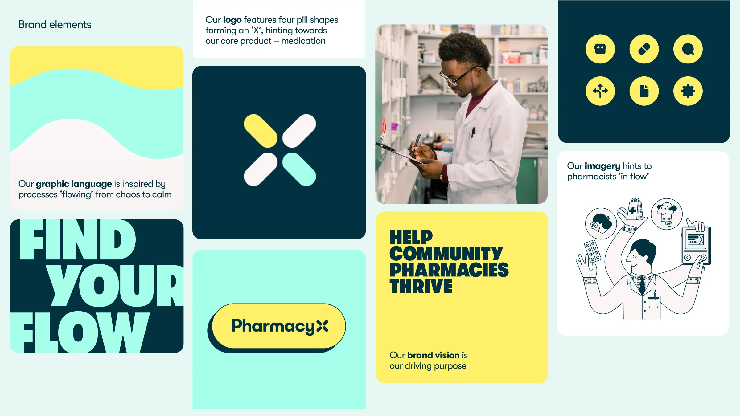
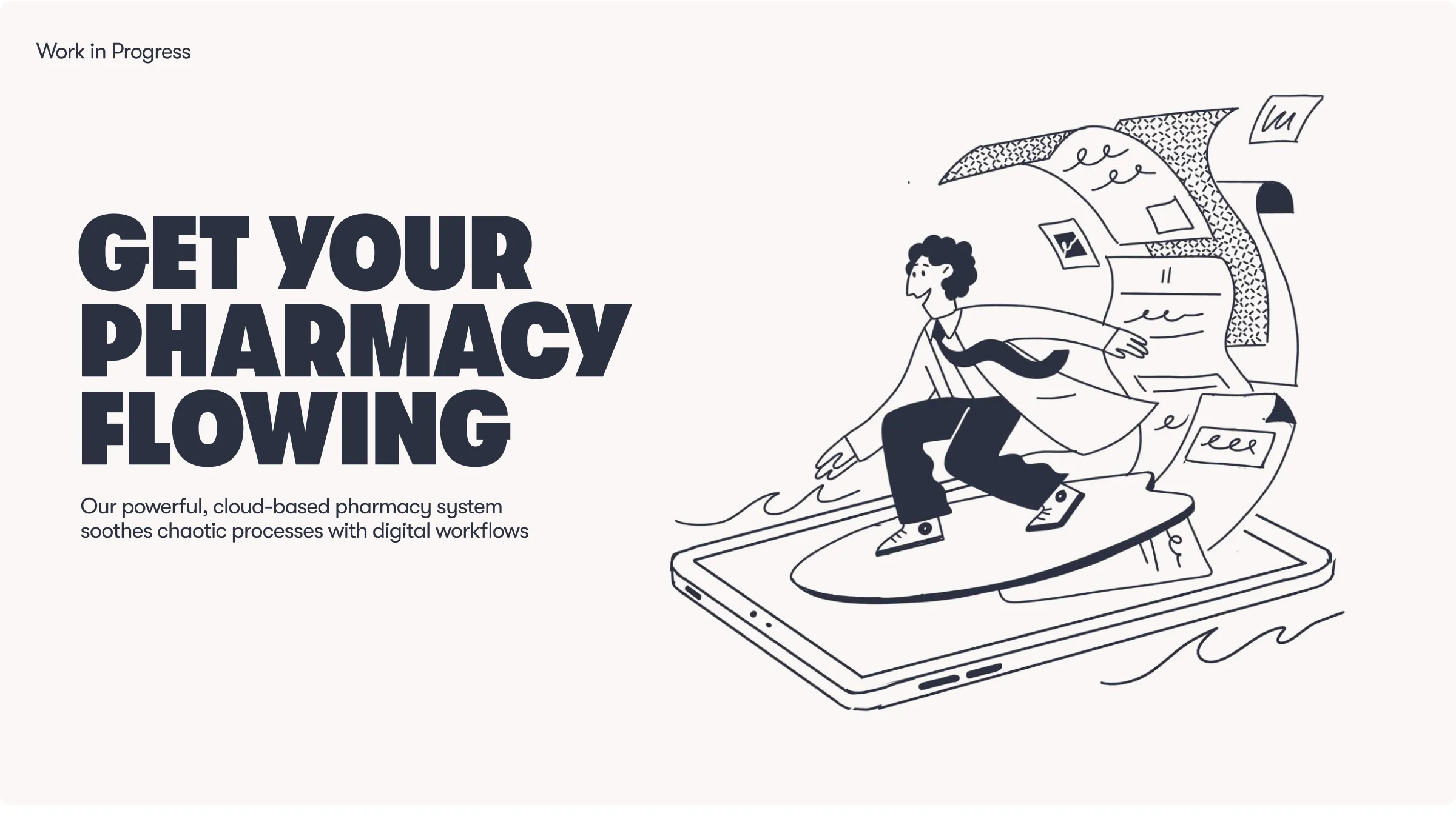
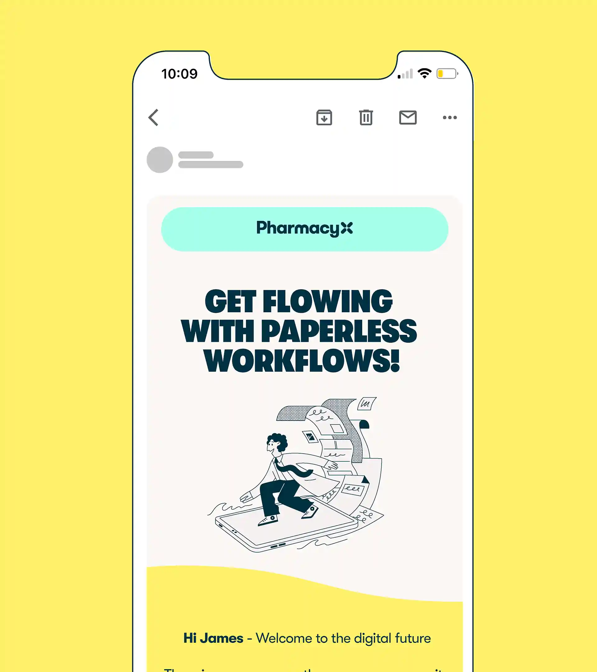
Our core brand idea of ‘Find Your Flow’ was conceptualised to represent how the software impacts the working life of customers – out with the chaos and in with the calm, streamlining processes and encouraging flow.

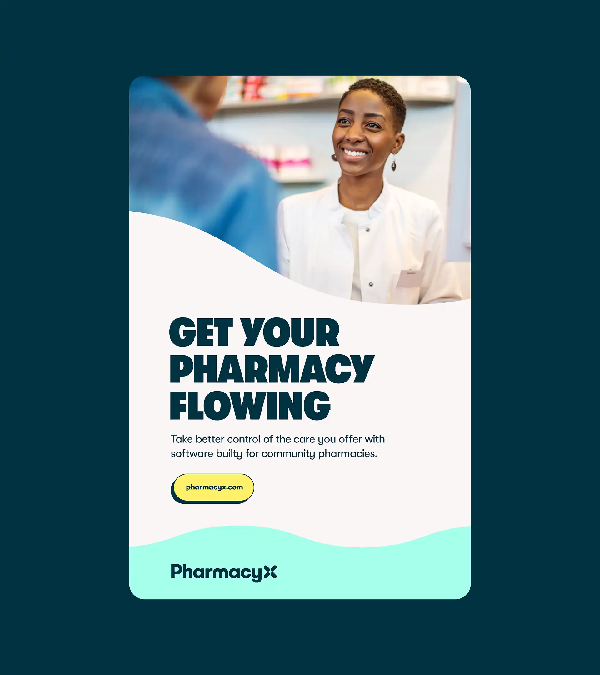


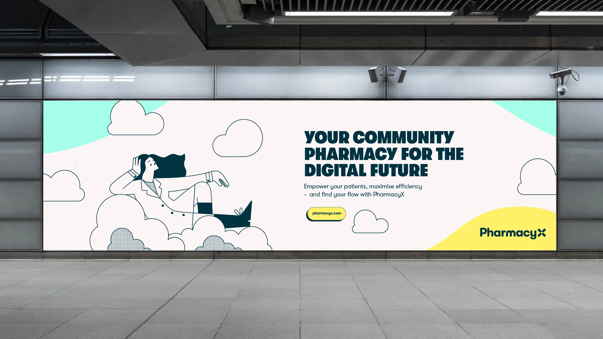
We designed and developed a user-centred website that brought the PharmacyX brand to life online — balancing approachability with innovation.
We focused on intuitive UX, clear messaging, and a warm visual language to showcase the product’s power while keeping community needs at the heart of the experience.


The result is a cohesive brand world that balances professionalism with warmth, bringing together every visual element to reflect PharmacyX’s unique vision.
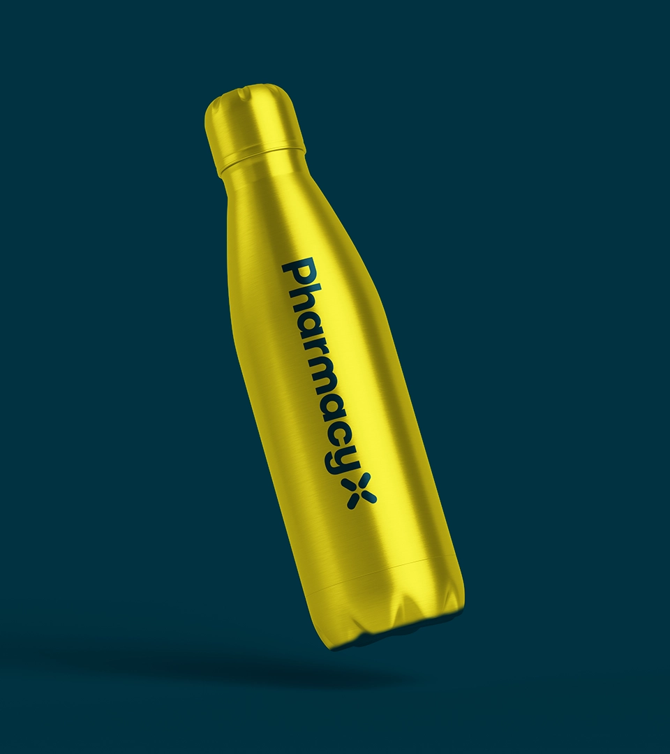
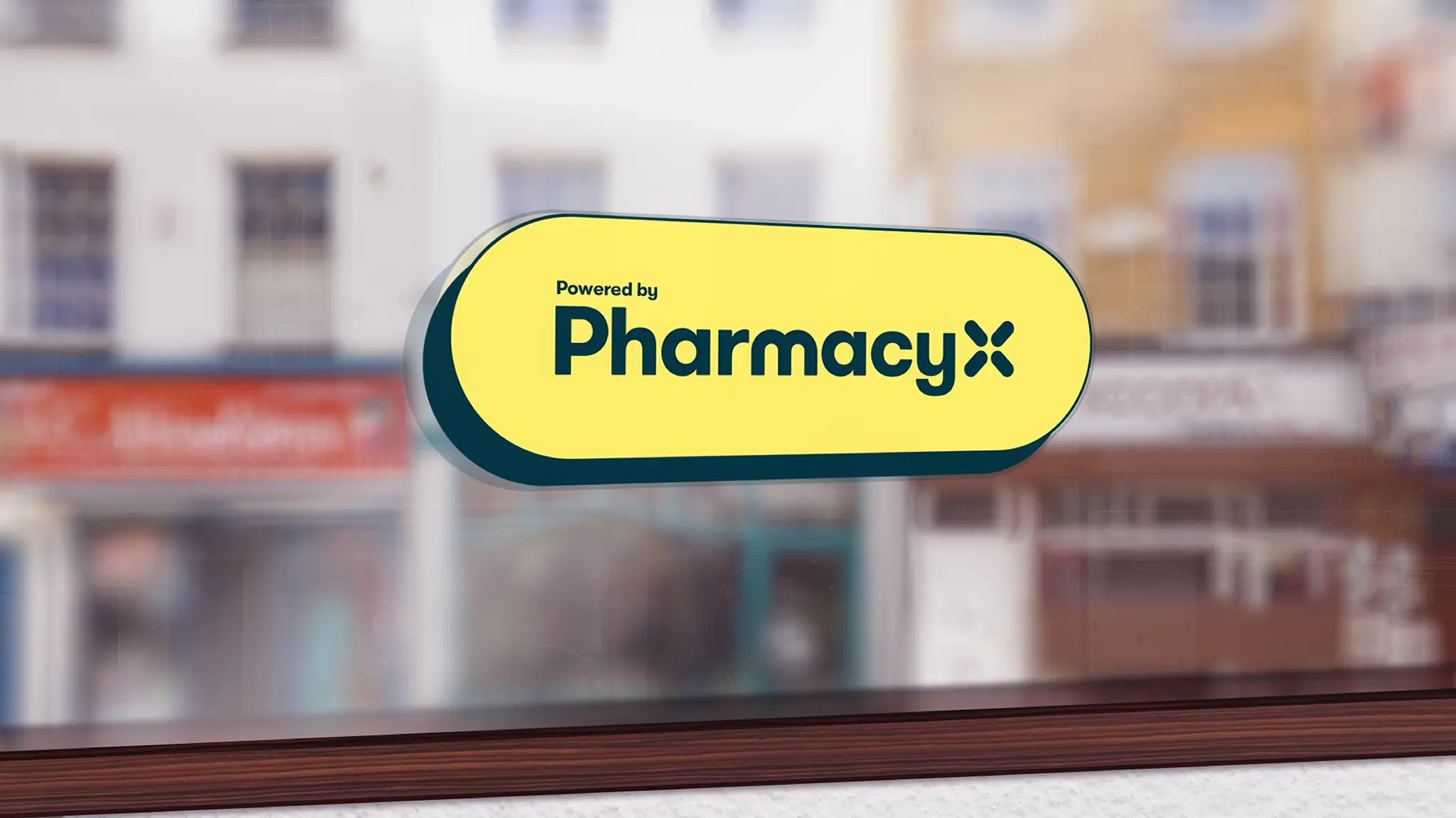
A new visual system of colour, logo, typography, photography and illustrations combine to create a sense of fluidity, calmness and personality. The logo ‘X’ is created by uniting four pill shapes, reflecting the core focus of our product – medication. A simple and harmonious colour palette reflects warmth and personality.
Mint is inspired by the colour of prescription paper, with yellow for a sense of optimism. Off white adds warmth, while navy helps ground the palette with a complementary contrasting colour. Bespoke illustrations are sophisticated and friendly, depicting pharmacists ‘in flow’, while simple rounded icons reinforce the fluidity within the identity.